In the realm of content marketing, newsletters serve as a direct line to your audience, carrying with them the potential to inform, engage, and convert. The role of typography within these newsletters cannot be overstated—it’s a critical component that can dictate the success or failure of your marketing efforts.
Font Pairing: The Secret to Great Typography
Font pairing is the strategic selection of fonts that work harmoniously together to create a visually cohesive and aesthetically pleasing design. The right combination of fonts can elevate a newsletter’s appeal and bolster the clarity of its content, whereas a mismatched pairing can result in visual discord and detract from the intended message.
When selecting fonts, marketers must consider the newsletter’s overall style and tone. A corporate newsletter might benefit from a traditional serif font paired with a sleek sans-serif, conveying a sense of professionalism and modernity. On the other hand, a creative or lifestyle newsletter might opt for a more dynamic combination, perhaps pairing a robust display font with a light, handwritten script to inject personality and flair.

Text Hierarchy: Guiding Readers Through the Content
Text hierarchy employs a structured visual arrangement of text elements to establish a clear reading path. By differentiating headings, subheadings, and body text through variations in font size, weight, and style, content creators can facilitate quick scanning and make key information stand out to readers.
Since readers often skim through content, a well-defined text hierarchy can streamline the discovery process, allowing readers to effortlessly locate the information they seek. Consistent formatting across these textual elements ensures a smooth reading journey, ultimately enhancing the reader’s engagement with the newsletter.
Color and Typography: Enhancing Visual Interest
Color can be a powerful ally in typography, aiding in the conveyance of mood and emphasis. When paired thoughtfully with type, color can accentuate important messages, categorize content, and even evoke emotional responses from readers.
For instance, a vibrant hue can draw attention to calls-to-action or highlights within the newsletter, while a subdued palette may be used to create a calming or professional atmosphere. It’s crucial to balance color with legibility, ensuring that the chosen colors complement rather than compete with the typeface and background.
Legibility and Accessibility: Ensuring Reader-Friendly Typography
Legibility and accessibility are fundamental considerations in newsletter typography. The fonts chosen should be easily readable for all audience members, including those with visual impairments. This means avoiding overly ornate fonts or those with poor contrast against the background.
Accessible typography also involves mindful font size selection and the inclusion of alternative text for images, ensuring that screen readers can effectively interpret the content. By prioritizing accessibility, newsletters can reach a wider audience and demonstrate a commitment to inclusivity.
Typography Best Practices for Newsletters
Understanding the power of typography is just the beginning. Applying best practices is key to crafting newsletters that are not only visually compelling but also resonate with readers on a deeper level.
Use a Limited Number of Fonts
While font pairing is vital, it’s equally important to avoid overwhelming readers with an excessive variety of fonts. A cluttered typographic landscape can be confusing and detract from the content’s core message.
Aim for a maximum of two or three fonts within a newsletter. Designate one font for headlines and another for body text, and if a third font is introduced, use it judiciously to add emphasis or to diversify the layout without compromising coherence.
Use Easy-to-Read Fonts
Readability is paramount when choosing fonts for a newsletter. Steer clear of fonts that are excessively decorative or complex, as they can prove difficult to read and potentially obscure the content. Opt instead for clear, legible fonts that offer a comfortable reading experience on various devices and screen sizes.
Font sizes must also be carefully considered, with headlines commanding attention through larger, bolder type and body text remaining easily digestible at smaller sizes. The goal is to strike a balance that ensures both impact and readability.

Create Contrast with Font Weights and Styles
Contrast is a cornerstone of engaging newsletter design. Employing a variety of font weights and styles can inject visual diversity and highlight critical elements within the content.
Bold type can be used for headlines to delineate them from body text, while italics or uppercase letters can emphasize specific points or quotes. The judicious use of contrasting typographic treatments can guide the reader’s attention and underscore important messages.
Pay Attention to Spacing
Spacing—or kerning—between letters, words, and lines plays a significant role in the readability and aesthetic of a newsletter. Proper kerning enhances the text’s appearance and can dramatically improve the overall design.
Letter spacing should be fine-tuned to achieve a balanced, harmonious look, avoiding the pitfalls of default settings. Word and line spacing require attention to ensure that the text is neither too cramped nor too sparse, as both extremes can disrupt the reading experience.
Be Consistent
Consistency is the hallmark of a polished newsletter. It applies to every typographic element, from font pairing and text hierarchy to the use of sizes, weights, and styles throughout the document.
Inconsistent typography can result in a fragmented and unprofessional appearance. Establishing a style guide that outlines the specific typographic standards for the newsletter can help maintain uniformity, streamline the design process, and ensure that all contributors adhere to the same high-quality standards.
Tools for Choosing Fonts and Creating Font Pairings
A plethora of tools and resources are available to aid in the selection of fonts and the creation of effective font pairings. These tools cater to various needs, from free offerings to subscription-based services.
Google Fonts: A Treasure Trove of Free Fonts
Google Fonts provides an extensive array of free fonts that are easily downloadable and suitable for use in newsletters. The platform offers a user-friendly interface and the flexibility to experiment with numerous font styles and pairings, making it an invaluable resource for marketers on a budget.
Adobe Fonts: Premium Fonts for Professional Use
Adobe Fonts operates on a subscription model, granting access to a wide selection of high-quality fonts. Geared toward professionals seeking top-tier typographic options, Adobe Fonts is ideal for those looking to invest in a more sophisticated and diverse font library.
Fontjoy: AI-Driven Font Pairing Inspiration
Fontjoy leverages artificial intelligence to generate font pairings based on user input and preferences. This innovative tool simplifies the pairing process and offers a source of inspiration for those seeking fresh and harmonious combinations for their newsletter designs.
Examples of Newsletter Typography Done Right
To underscore the impact of typography on newsletter effectiveness, let’s examine a couple of standout examples that showcase diverse typographic approaches.
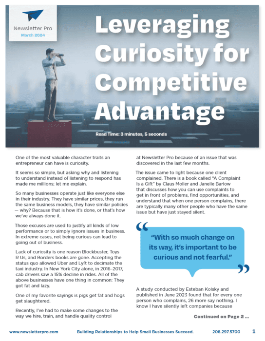
Example 1: Simple and Clean
This newsletter exemplifies a minimalist approach, utilizing just two fonts consistently throughout. The sans-serif font applied to both headlines and body text ensures readability and imparts a contemporary, professional vibe. A serif font for the logo introduces an element of sophistication, subtly differentiating it from the rest of the content.
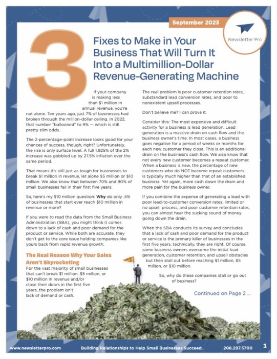
Example 2: Bold and Eye-Catching
In contrast, this newsletter adopts a more daring design, combining various fonts and styles to captivate the reader’s attention. A handwritten font for headlines contrasts with a sans-serif body font, creating an engaging, playful look. Strategic use of font sizes and styles further enhances contrast and navigates the reader through the newsletter’s content.
In Conclusion
Typography is a critical aspect of newsletter design, with the power to significantly influence the success of your marketing communications. By adhering to established best practices and leveraging the appropriate tools, you can create newsletters that are not only visually stunning but also deeply engaging for your audience. Embrace simplicity, uphold consistency, and prioritize readability to ensure your newsletters rise above the competition in the inbox and keep readers eagerly anticipating each new issue. With thoughtful typography, your newsletters will not only be read—they’ll be remembered.
Ready to Elevate Your Newsletter Design?
If you’re eager to take your newsletter design to the next level and ensure your communications stand out, partnering with industry experts can make all the difference. At Newsletter Pro, we specialize in crafting visually appealing and highly effective newsletters tailored to your brand’s unique voice and audience.
Connect with Us Today
Transform your newsletter into a powerful marketing tool by leveraging our expertise in typography, design, and content creation. Contact Newsletter Pro today to discuss your needs and start creating newsletters that will captivate and engage your readers.
Elevate your newsletter game with Newsletter Pro—where innovation meets excellence.


